
Lines that Speak: Understanding the Emotional Language of Marks in Art
- Beatrice Ruggeri
- May 3
- 3 min read

Updated: May 16
Lines are more than just simple strokes on a canvas. They carry emotions, create moods, and communicate messages before we even recognize the subject they outline. The psychology behind different types of lines reveals how artists use marks to evoke feelings and shape our perception. This post explores how various lines affect us subconsciously, comparing distinct styles to uncover what lines say beyond their form.
How Lines Shape Emotion
Lines have a unique power to influence how we feel when we look at art. Their shape, weight, and movement can create tension, calm, excitement, or anxiety. For example, jagged lines often produce a sense of unease or conflict. Their sharp angles and abrupt changes mimic natural signals of danger or discomfort, triggering a subconscious alertness. On the other hand, curved lines tend to soothe. Their smooth, flowing nature suggests softness and harmony, inviting the viewer to relax.
The thickness of a line also changes its emotional impact. Thin lines can feel delicate, fragile, or tentative, while thick lines often convey strength, boldness, or confidence. A single thick contour can dominate a composition, demanding attention and suggesting power. Conversely, a series of thin, light lines might create an impression of vulnerability or subtlety.
Controlled vs. Chaotic Marks
The way lines are applied—whether carefully controlled or wildly chaotic—adds another layer of meaning. Controlled lines, drawn with precision and consistency, often communicate order, stability, and clarity. They guide the eye smoothly across the artwork, creating a sense of balance. Chaotic marks, with irregular, overlapping, or scratchy strokes, evoke energy, tension, or emotional turmoil. These marks can feel raw and immediate, as if the artist’s emotions are spilling onto the page.
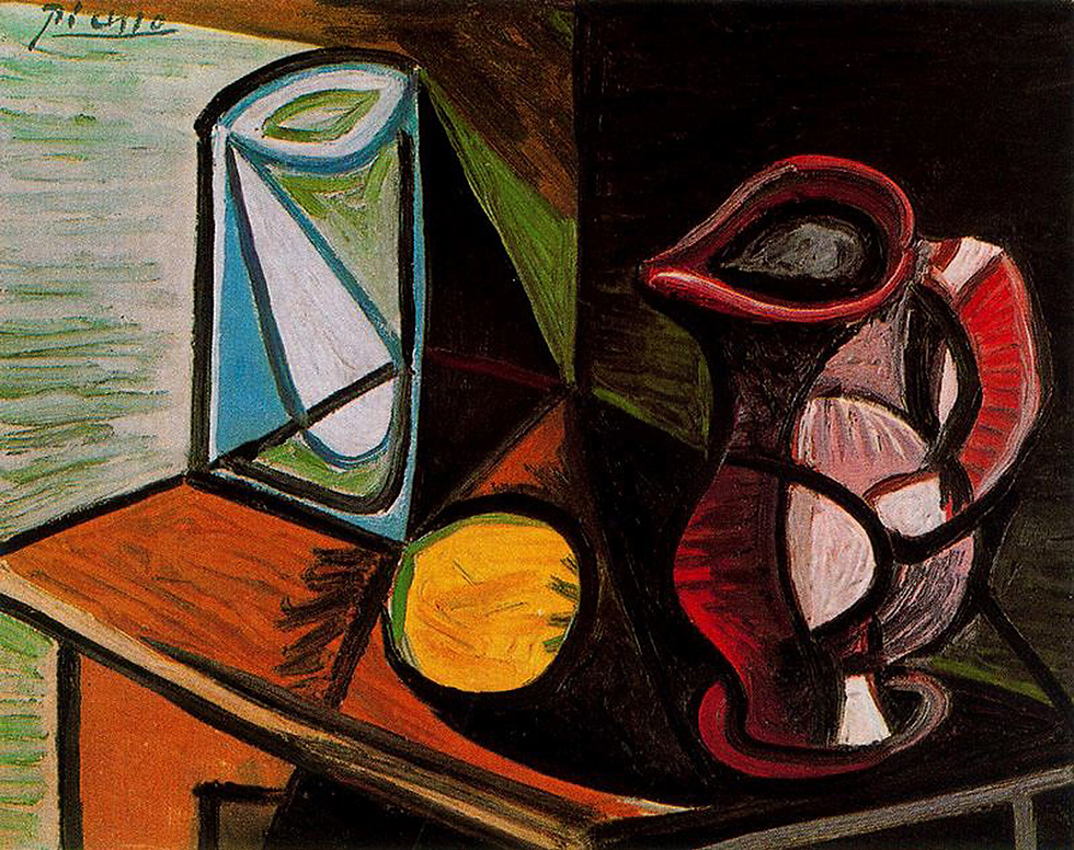
This contrast is visible when comparing artists with very different line styles. Pablo Picasso’s bold contours, for example, are deliberate and confident. His lines define shapes clearly and with purpose, often simplifying forms to their essence. These strong, controlled lines communicate clarity and strength, even when the subject is abstract or fragmented.
By contrast, Egon Schiele’s lines are scratchy, nervous, and full of tension. His marks often seem to tremble or hesitate, reflecting the emotional intensity and vulnerability of his subjects. The chaotic quality of his line work conveys anxiety and rawness, making the viewer feel the artist’s inner turmoil before even recognizing the figure.
What Lines Say Before the Subject Registers
When you first glance at a drawing or painting, the lines speak to you before the subject does. They set the tone and mood, preparing your emotional response. A smooth, flowing line might invite calm and curiosity, while a jagged, erratic line can create discomfort or excitement. This nonverbal communication is why line work is so crucial in art.
For example, in Picasso’s portraits, the bold, sweeping lines suggest confidence and control. Even if the face is distorted or abstract, the viewer senses strength and clarity. Schiele’s portraits, with their scratchy, restless lines, communicate fragility and emotional complexity. The marks themselves tell a story of tension and vulnerability.
The Subtle Power of Line Weight
Line weight—the thickness or thinness of a line—can guide the viewer’s eye and influence emotional tone. Artists use varying line weights to create depth, focus, and contrast. A thick line around a figure’s outline can make it stand out, suggesting importance or dominance. Thin lines within the figure might add delicate details, implying softness or subtlety.
In emotional terms, thick lines often feel assertive or aggressive, while thin lines can feel hesitant or gentle. This difference affects how we interpret the mood of the artwork. For instance, a landscape drawn with heavy, dark lines might feel dramatic or foreboding, while the same scene rendered with light, thin lines could feel peaceful or airy.
The Language of Marks in Everyday Art
Understanding the emotional language of lines helps us appreciate art on a deeper level. It also influences how artists communicate visually in everyday contexts, from sketches to graphic design. Recognizing how line types affect mood can guide artists in choosing marks that support their message.
For viewers, paying attention to lines reveals hidden emotions and intentions behind a piece. It invites us to look beyond the obvious subject and connect with the feelings the artist conveys through their marks.


Comments